How to Optimize Images for SEO and Faster Website Speed
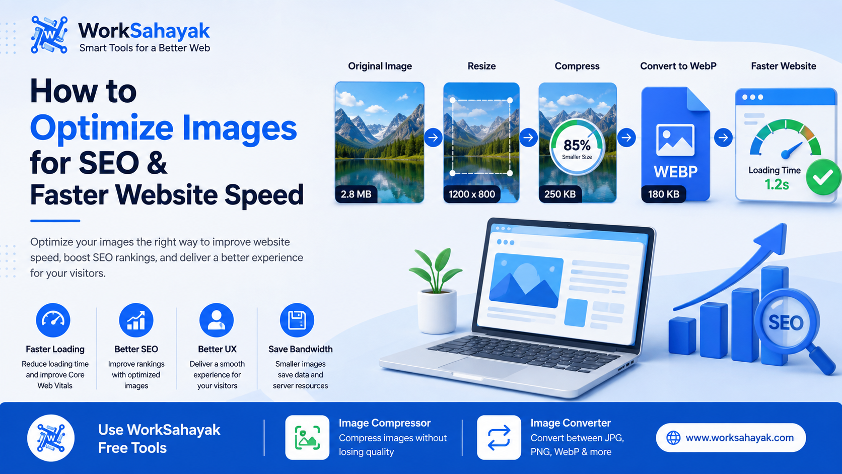
Learn how to optimize website images for better SEO, faster loading, improved Core Web Vitals, and a better user experience using the right format, size, compression, filenames, and alt text.
Images are an essential part of modern websites. They make blog posts more attractive, help explain products and services, and create a better visual experience for visitors. However, large or poorly optimized images can also make a website slower.
Image optimization is the process of reducing image file size while maintaining good visual quality. When done correctly, it can help your pages load faster, reduce bandwidth usage, and provide a better experience across desktop and mobile devices.
In this guide, we'll explain how to optimize images for SEO and website performance using simple techniques that anyone can follow.
Why Is Image Optimization Important?
Images can represent a significant portion of the data downloaded when a web page loads. Serving unnecessarily large images to users can waste bandwidth and increase loading time.
Google recommends optimizing images for both speed and quality. It also recommends using responsive images, descriptive filenames, useful alt text, and appropriate image formats. :contentReference[oaicite:1]{index=1}
A well-optimized image can help you:
- Improve website loading speed
- Reduce image file sizes
- Save bandwidth
- Improve mobile user experience
- Reduce unnecessary server usage
- Improve image accessibility
- Help search engines understand your images
1. Choose the Right Image Format
One of the easiest ways to optimize an image is to select an appropriate format.
WebP
WebP is a modern image format designed for the web. It supports both lossy and lossless compression and can provide smaller files while maintaining good visual quality.
For many websites, WebP is a practical choice for photographs, banners, product images, and other web graphics.
JPG
JPG is still a popular format for photographs and images containing many colors and gradients. It uses lossy compression and can produce relatively small files.
JPG is particularly useful when broad compatibility and photographic image quality are important.
PNG
PNG uses lossless compression and supports transparency. It is useful for logos, screenshots, icons, and graphics where sharp edges or transparent backgrounds are important.
However, PNG files can be considerably larger than compressed JPG or WebP files for photographic images.
2. Compress Images Before Uploading
Uploading a 3 MB or 5 MB image when a much smaller version would look almost identical is unnecessary.
Image compression removes unnecessary data from an image so that the file requires less storage and bandwidth. The goal is to find a good balance between file size and visual quality.
Before uploading images to your website, compress them and compare the result with the original image.
You can use the Worksahayak Image Compressor to reduce image file sizes quickly without manually installing image-editing software.
3. Resize Images to the Required Dimensions
Compression is not the only important step. You should also resize images according to where they will be displayed.
For example, if your website displays an image at 800 pixels wide, uploading a 4000-pixel-wide image may send much more data than necessary.
Responsive images allow browsers to choose an appropriate image resource for different screen sizes. Google recommends using techniques such as srcset and the picture element for responsive images. :contentReference[oaicite:2]{index=2}
Instead of uploading extremely large images for every device, prepare appropriately sized versions whenever possible.
4. Use Descriptive Image File Names
Don't leave important images with filenames such as:
- IMG0001.jpg
- DSC12345.png
- image1.webp
Instead, use short and descriptive filenames that explain what the image contains.
For example:
- website-image-compression.webp
- webp-vs-jpg-comparison.jpg
- image-optimization-guide.png
Google says descriptive filenames can provide useful clues about the subject of an image. :contentReference[oaicite:3]{index=3}
5. Add Useful Alt Text
Alt text describes an image for users who cannot see it and also helps search engines understand the subject of the image.
A good alt text should describe the image naturally and should not be stuffed with keywords.
Bad example:
<img src="image.webp" alt="image SEO image optimization SEO image compressor SEO">
Better example:
<img src="website-image-compression.webp" alt="Website image compression comparison">
Google specifically recommends useful, descriptive alt text and warns against keyword stuffing. :contentReference[oaicite:4]{index=4}
6. Use Lazy Loading for Images Below the Fold
If a page contains many images, loading every image immediately can increase the amount of data requested during the initial page load.
For images that are below the initial viewport, browser-level lazy loading can defer loading until the images are closer to being visible.
You can use:
<img src="example.webp" loading="lazy" alt="Example image" width="800" height="500">
However, don't blindly lazy-load important images that appear immediately when the page opens. Web performance guidance recommends avoiding lazy loading for important above-the-fold or LCP images. :contentReference[oaicite:5]{index=5}
7. Always Define Image Dimensions
Adding width and height attributes helps the browser reserve the correct amount of space before an image finishes loading.
This can help reduce unexpected layout movement while the page is loading.
For example:
<img src="website-speed.webp" alt="Website speed optimization" width="1200" height="675">
Defining image dimensions is recommended as part of good image loading practices. :contentReference[oaicite:6]{index=6}
8. Use Responsive Images for Different Devices
A desktop computer may have enough screen space to display a large image, while a smartphone may only need a much smaller version.
Serving a huge desktop image to a mobile device can waste data and increase loading time.
Responsive images allow the browser to select an appropriate image based on the device and display size. :contentReference[oaicite:7]{index=7}
A simple example is:
<img
src="image-800.webp"
srcset="image-400.webp 400w,
image-800.webp 800w,
image-1200.webp 1200w"
sizes="(max-width: 600px) 400px, 800px"
alt="Website image optimization">
9. Don't Sacrifice Quality for Extremely Small Files
Image optimization does not mean making every image as small as possible.
If compression is too aggressive, photographs can become blurry, blocky, or full of visible artifacts.
The goal should be a balance between:
- Image quality
- File size
- Loading performance
- User experience
A slightly larger image that looks excellent can sometimes be a better choice than an extremely compressed image that looks poor.
10. Optimize Images for Mobile Users
Mobile users may have smaller screens, limited data plans, or slower network connections. Sending unnecessarily large images to mobile devices can waste bandwidth.
Responsive images and appropriate compression can help reduce the amount of data transferred to smaller devices. :contentReference[oaicite:8]{index=8}
Always test your website on both desktop and mobile devices after making image changes.
Image Optimization Checklist
Before publishing a page, use this quick checklist:
- Choose the appropriate image format
- Resize oversized images
- Compress images before uploading
- Use descriptive filenames
- Add meaningful alt text
- Use responsive images where appropriate
- Lazy-load images below the fold
- Don't lazy-load important above-the-fold images
- Specify image width and height
- Check the final page on mobile devices
How Worksahayak Can Help
Optimizing images manually can take time, especially when you have many images to process.
Worksahayak provides online tools designed to make image optimization easier.
With the Worksahayak Image Compressor, you can reduce image file sizes before using them on your website.
If you need to change an image from one format to another, you can use the Worksahayak Image Converter to convert between supported formats such as JPG, PNG, WebP, GIF, BMP, and TIFF. :contentReference[oaicite:9]{index=9}
Final Thoughts
Image optimization is one of the simplest ways to improve the technical performance of a website.
Start by choosing the right format, resizing large images, compressing files, and writing useful alt text. Then take your optimization further with responsive images and appropriate lazy loading.
Remember that good image optimization is not about making every file as small as possible. It is about delivering the right image, at the right size, with the right quality, to the right device.
If you regularly work with website images, try the free Image Compressor and Image Converter from Worksahayak.
About Worksahayak Team
We build fast, privacy-first utilities for everyday image and document workflows — free for everyone to use.
Learn more about us