What Is Image Resizing and Why Is It Important for Websites?
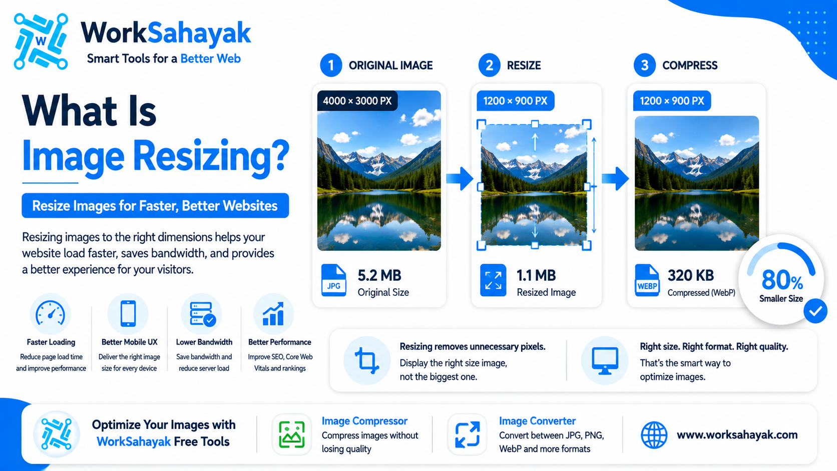
Learn what image resizing is, why oversized images slow down websites, and how to resize images correctly for faster loading, better performance, and a better user experience.
Images are an important part of almost every modern website. They make blog posts more attractive, help customers understand products, and make websites more visually engaging. However, using images that are much larger than necessary can negatively affect website performance.
This is where image resizing becomes useful.
Image resizing changes the dimensions of an image while keeping the image in the same general format. For example, a 4000 × 3000 pixel image can be resized to 1200 × 900 pixels before being uploaded to a website.
In this guide, we'll explain what image resizing is, why it matters, how it differs from image compression, and how to choose the right image dimensions for your website.
What Is Image Resizing?
Image resizing means changing the width and height of an image.
For example, imagine you have an image that is:
- 4000 pixels wide
- 3000 pixels high
- 5 MB in file size
If your website only displays that image at 1200 pixels wide, there may be little reason to upload the original 4000-pixel version.
Resizing the image to a more appropriate dimension can significantly reduce the amount of data that needs to be processed and delivered.
Image Resizing vs Image Compression
Image resizing and image compression are related, but they are not the same thing.
| Feature | Image Resizing | Image Compression |
|---|---|---|
| Purpose | Changes dimensions | Reduces file size |
| Example | 4000px → 1200px | 2 MB → 500 KB |
| Changes Width/Height | Yes | Usually No |
| Reduces File Size | Often | Yes |
For the best results, you can resize an oversized image first and then compress it.
Why Should You Resize Images for a Website?
Uploading unnecessarily large images can increase page weight and cause visitors to download more data than they actually need.
Resizing images to appropriate dimensions can help reduce unnecessary image data and improve the overall efficiency of a website.
1. Faster Page Loading
Smaller images generally require less data to download.
If a page contains several large images, reducing their dimensions can make a significant difference to the amount of data transferred.
2. Better Mobile Experience
Mobile users may be viewing your website on a smaller screen and may have slower network connections.
Sending a huge desktop-sized image to a smartphone can waste bandwidth.
Using appropriately sized images can help create a smoother browsing experience.
3. Lower Bandwidth Usage
Large image files require more data to be transferred from your server to visitors.
Resizing images before uploading them can reduce unnecessary bandwidth usage, especially on image-heavy websites.
4. Better Website Performance
Images can represent a large portion of a web page's total size.
Optimizing image dimensions is therefore an important part of website performance optimization.
What Image Dimensions Should You Use?
There is no single image dimension that works for every website.
The correct size depends on where the image will be displayed.
For example:
- Blog content image: around 1200px wide
- Website banner: depends on the design and layout
- Product image: depends on the product gallery
- Thumbnail: usually much smaller
- Logo: should be based on the actual display size
The important rule is simple: don't upload an image that is dramatically larger than the size at which it will actually be displayed.
How to Resize an Image Correctly
Step 1: Check the Original Dimensions
Before resizing an image, check its current width and height.
You may discover that a camera or smartphone image is several thousand pixels wide even though your website only needs a fraction of that size.
Step 2: Determine the Required Size
Check where the image will appear on your website.
If the content area is approximately 1000 pixels wide, there is usually no need to upload a 5000-pixel-wide image simply because it is available.
Step 3: Maintain the Aspect Ratio
Always try to maintain the original aspect ratio unless you intentionally want to crop or stretch the image.
For example:
- 1920 × 1080 → 1280 × 720
- 1600 × 1200 → 1200 × 900
- 1200 × 800 → 900 × 600
Maintaining the aspect ratio prevents the image from looking stretched or distorted.
Step 4: Compress the Resized Image
After resizing, compression can further reduce the file size.
You can use the Worksahayak Image Compressor to reduce the final file size before uploading the image to your website.
Should You Resize Images Before or After Compression?
In many workflows, it makes sense to resize an unnecessarily large image before compression.
For example:
Original: 5000 × 3500 pixels — 5 MB
↓
Resize: 1600 × 1120 pixels
↓
Compress: approximately 400–700 KB depending on the image and quality settings
The exact final file size will vary depending on the image content, format, and compression settings.
Resize JPG, PNG, and WebP Images
Image resizing can be applied to many common image formats.
JPG
JPG is commonly used for photographs and images containing many colors.
PNG
PNG is useful for logos, screenshots, graphics, and images that require transparency.
WebP
WebP is a modern web-focused format that supports both lossy and lossless compression.
You can resize an image first and then choose an appropriate format depending on your website requirements.
Common Image Resizing Mistakes
Uploading Original Camera Images
Modern cameras and smartphones can produce extremely large images. Uploading these files directly to a website is often unnecessary.
Stretching Images
Changing width and height independently can distort an image. Maintain the aspect ratio whenever possible.
Using the Same Large Image Everywhere
A large hero image may require different dimensions from a small thumbnail. Using one huge image for every location can waste bandwidth.
Ignoring Mobile Devices
Always consider how your images will appear on smartphones and tablets.
Image Resizing Best Practices
- Check the required display dimensions
- Resize oversized images
- Maintain the correct aspect ratio
- Compress images after resizing
- Choose an appropriate image format
- Use responsive images where appropriate
- Add descriptive alt text
- Use meaningful image filenames
- Test images on desktop and mobile
Resize and Optimize Images with Worksahayak
Preparing images for a website doesn't have to be complicated.
Worksahayak provides online image tools that can help you prepare images for different web projects.
After preparing your image dimensions, you can use the Image Compressor to reduce the file size.
If you need to change the image format, the Worksahayak Image Converter can help you convert images between supported formats.
Final Thoughts
Image resizing is a simple but important part of website optimization.
Instead of uploading unnecessarily large images, choose dimensions that match how the image will actually be displayed. Then compress the resized image and select an appropriate format.
This simple workflow can help reduce unnecessary data, improve website performance, and provide a better experience for your visitors.
If you're preparing images for your website, try the Worksahayak Image Compressor and Image Converter.
About Worksahayak Team
We build fast, privacy-first utilities for everyday image and document workflows — free for everyone to use.
Learn more about us